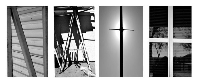
 I was having some trouble trying to get the layers at first and trying to find things that looked like the letters I needed that is also why I chose a shorter name. I was proud of figuring that it wasn't as hard to follow the directions to creating my name project. I like best the outcome of my artwork and how the black and white makes it look better than the original colors, it is all one color and looks cool. I think I could have come up with better things to represent my letters and make it longer.
0 Comments
Leave a Reply. |
AuthorMy name is Natalee, I am a senior at Rbv, and I enjoy taking photos. Archives
May 2017
Categories |
 RSS Feed
